Real estate · Website redesign case study
M3M India Noida: reframing luxury real estate for digital discovery
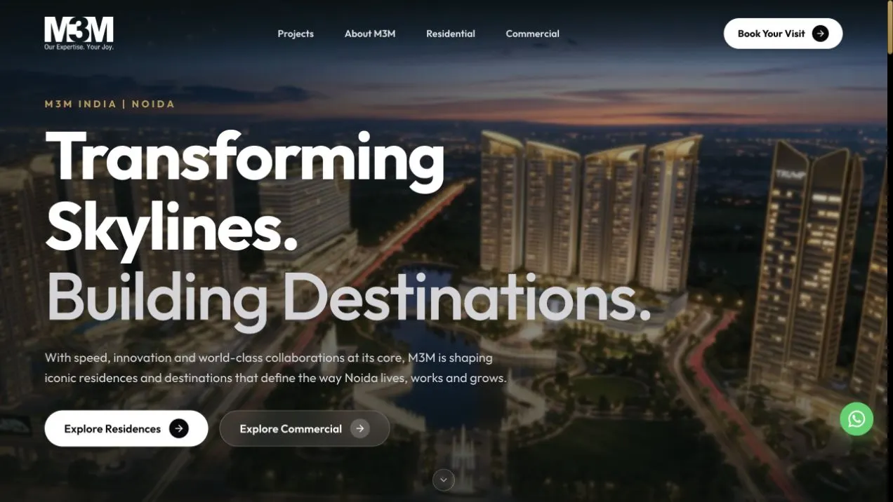
An immersive property experience that connects architectural storytelling with clearer residential and commercial journeys, consistent project presentation and contextual enquiry options.
- Industry
- Luxury real estate
- Experience
- Brand + property website
- Scope in source
- 17 routes · 7 project pages
- Technology
- React · Vite · React Router
01 / CONTEXT & CHALLENGE
Luxury is also a decision-making experience
Architectural imagery creates desire. Location, property type, layouts and clear next steps help a visitor evaluate that desire. The existing M3M Noida website already contained project information, residential and commercial collections, brochure and floor-plan actions, brand content and enquiry forms. The opportunity was to make this breadth easier to enter while creating a coherent premium presentation.
The central challenge: express the brand’s luxury positioning while helping visitors find a relevant development and understand how to take the next step.
Clarify the first decision
Make residential and commercial browsing visible early, so visitors can choose a relevant collection without first discovering a hidden menu.
Unify the visual experience
Use architectural imagery, consistent typography, generous spacing and recurring interface patterns across brand and project pages.
Connect interest to enquiry
Provide a logical progression from a project preview to property information and an appropriate next contact action.
Who the experience needs to serve
These working audience models are inferred from the property content and contact options; they are assumptions to validate with buyers and advisors.
Residential buyer
Needs location, architectural character, amenities and residence configurations. A direct residential entry point leads into dedicated project information.
Commercial buyer
Needs a clear property category, location context and relevant sales information. A separate commercial path helps narrow the collection.
Returning visitor
Already knows a development and needs fast access to its details, brochure, floor plans or contact options. Recognisable names and direct detail links support this intent.
02 / EXPERIENCE STRATEGY
Discover. Evaluate. Connect.
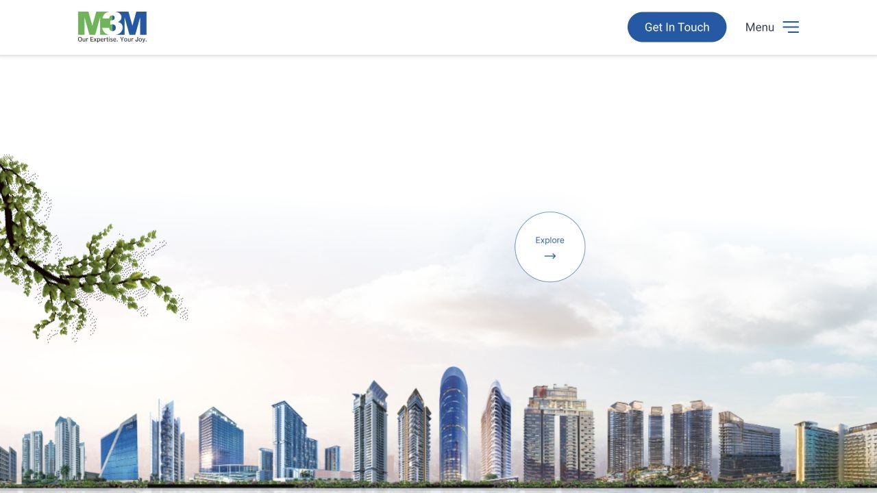
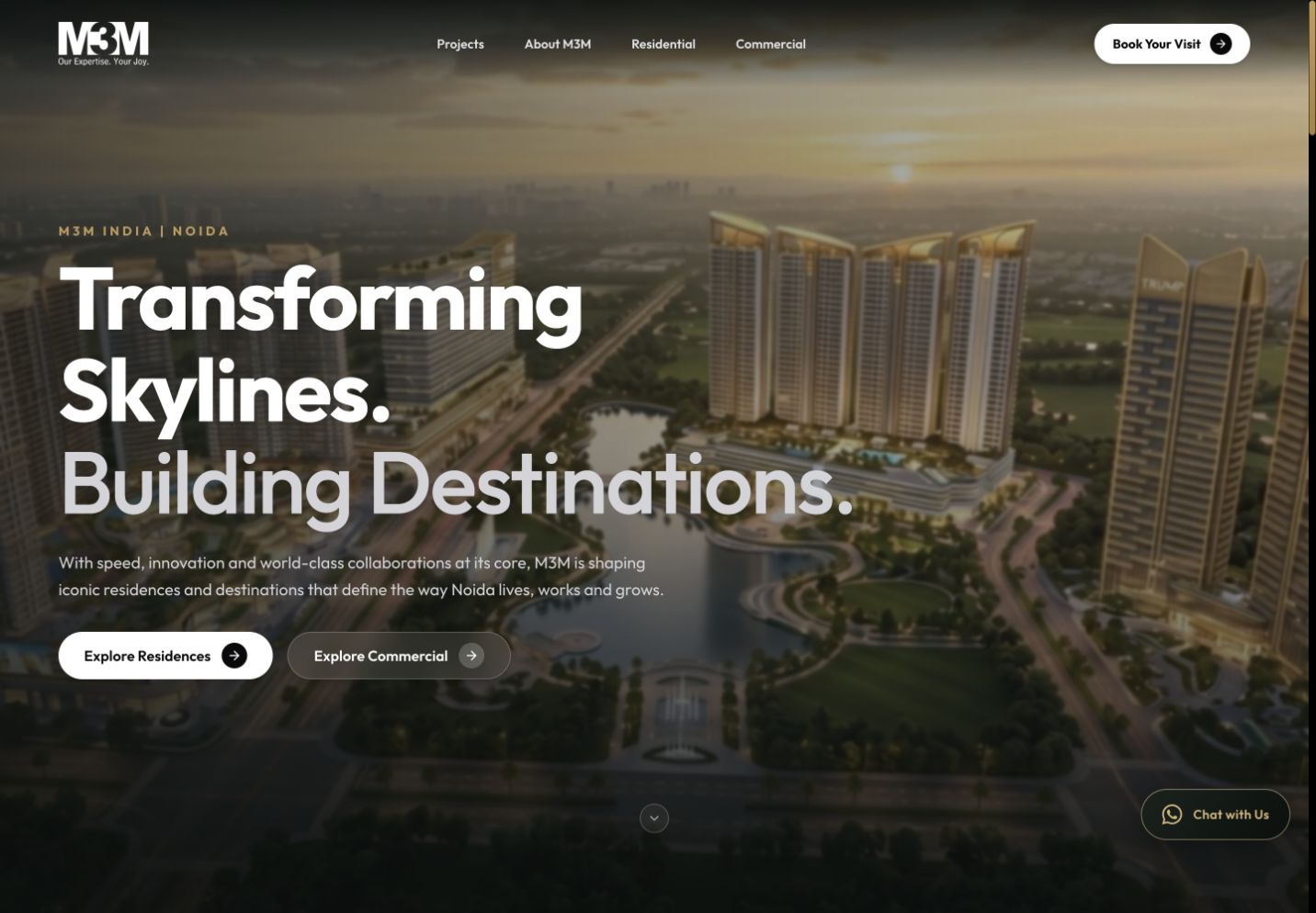
The captured legacy opening prioritises atmosphere: a skyline composition, compact navigation and a general Explore action. The redesign places the first meaningful browsing choice alongside the brand story. The collection then serves as an overview, while individual project pages carry deeper evaluation content.
01
Discover
Homepage → Residential or Commercial → Project collection
02
Evaluate
Project card → Detail page → Amenities, gallery, layouts and location
03
Connect
Private preview → Sales enquiry, telephone or WhatsApp
Experience structure illustrated from the implementation, rather than a measured user journey. Brand context, news, contact and supporting legal pages sit alongside these property routes.
03 / EIGHT BEFORE & AFTER COMPARISONS
The transformation, section by section
Actual desktop captures from the previous WordPress website and the new live website show how the same browsing tasks are presented in each version. Each image opens at full size. Captures retain their original proportions; viewport sizes differ between the two sources.
Homepage: a clear first decision
Before · WordPress
After · New website
Design rationale
The new opening connects the architectural impression with an immediate choice of property category.
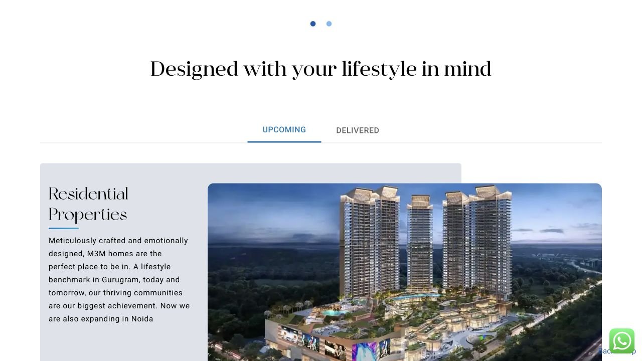
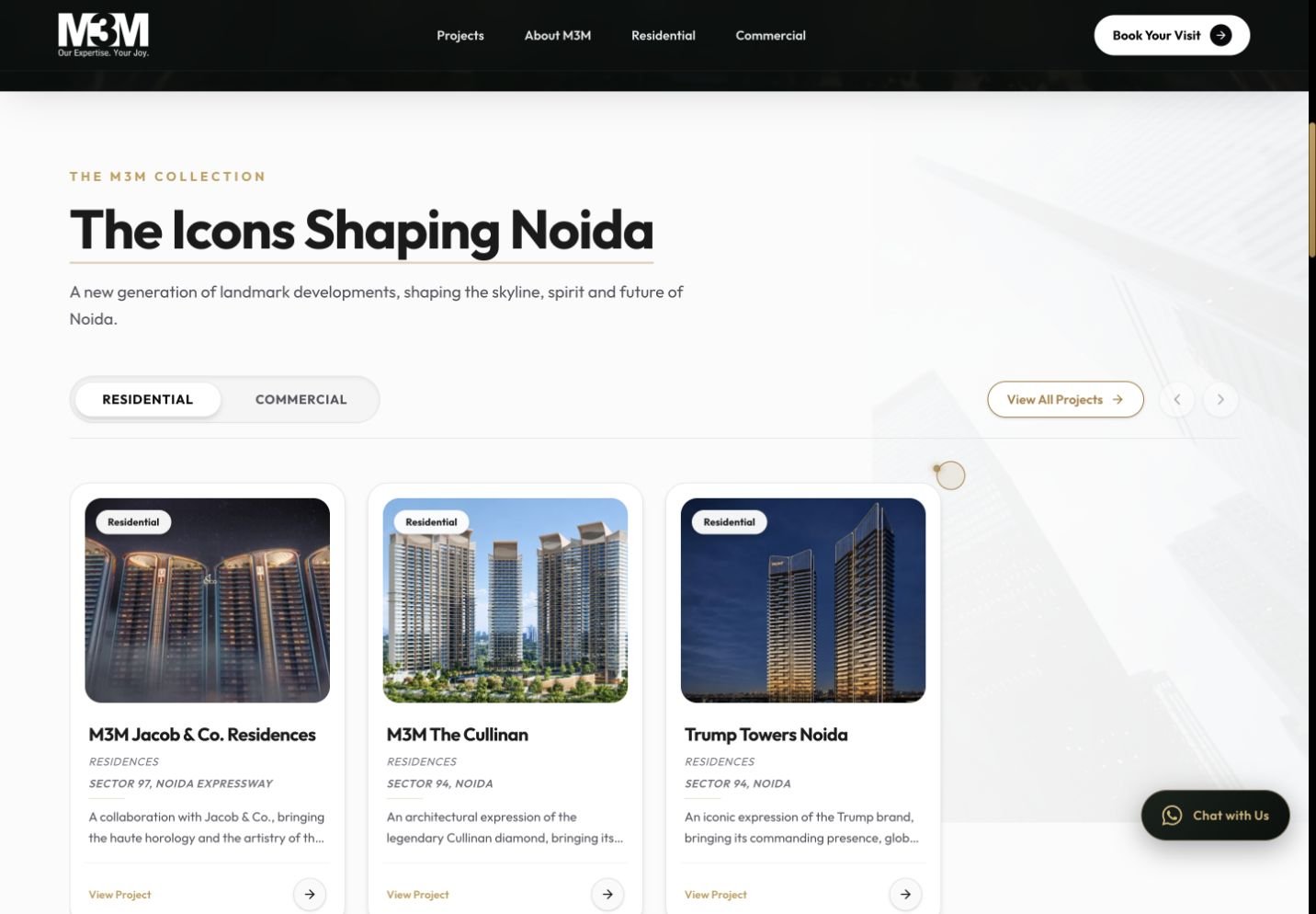
Property collection: a repeatable scanning pattern
Before · WordPress
After · New website
Design rationale
The collection shifts emphasis from a large single-property presentation to comparing several projects in a shared card structure.
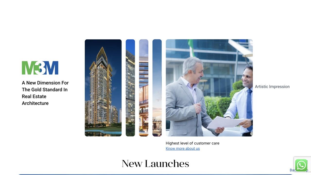
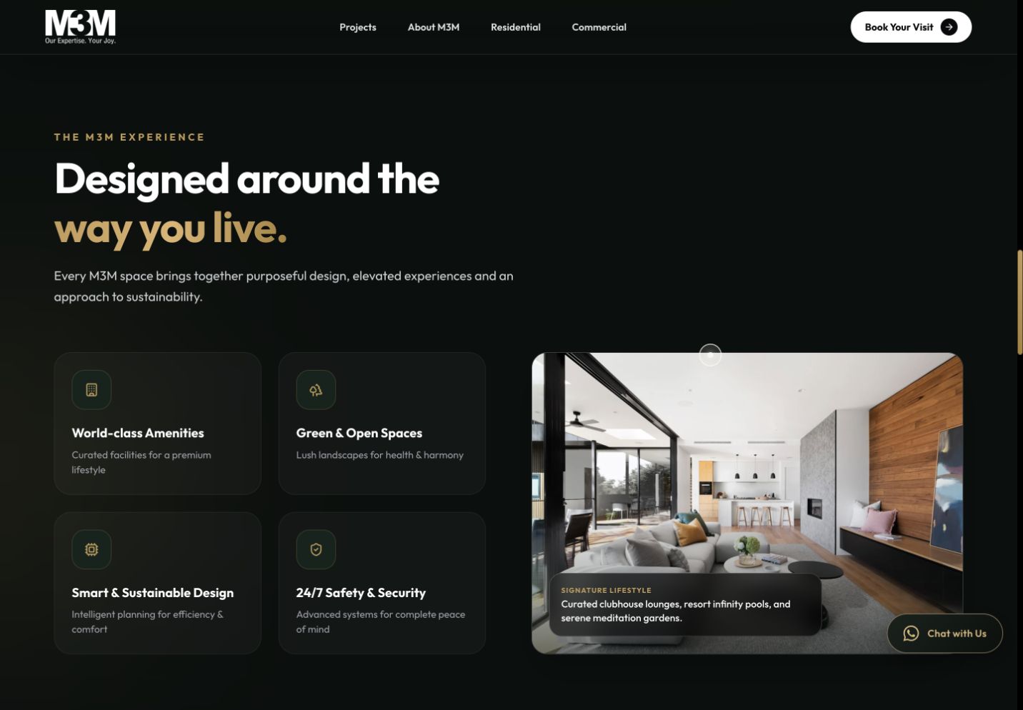
Lifestyle: from brand values to experience themes
Before · WordPress
After · New website
Design rationale
The redesign organises the lifestyle story into visible themes rather than relying on one expanded image panel at a time.
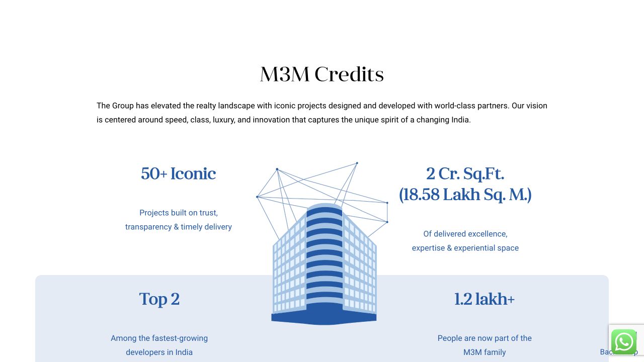
Brand scale: a more compact information hierarchy
Before · WordPress
After · New website
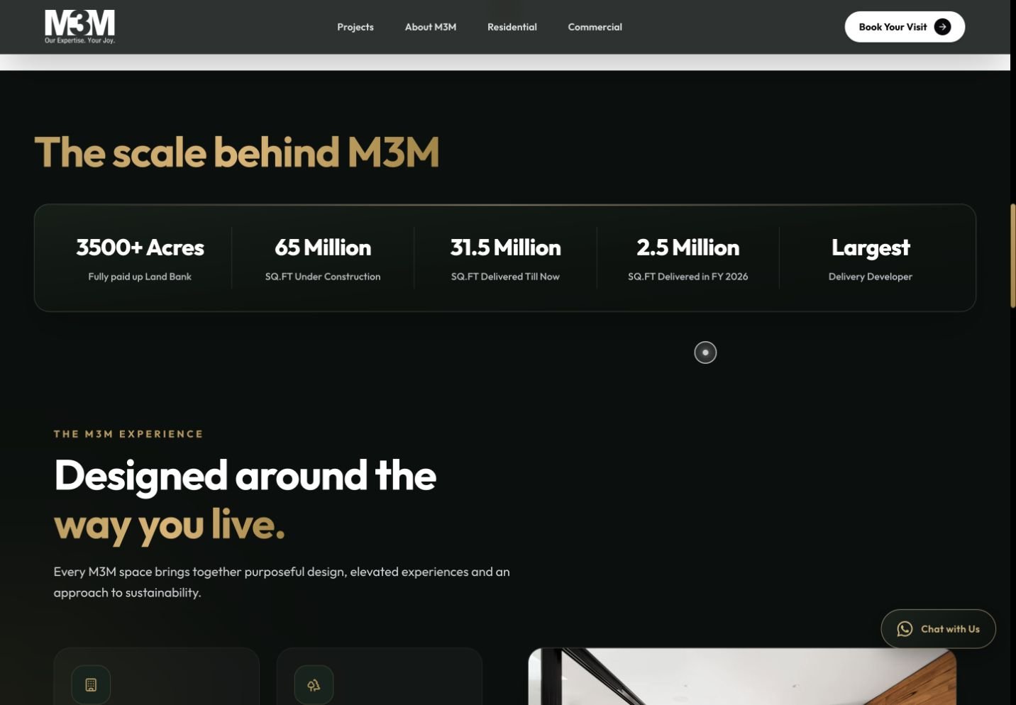
Design rationale
Consistent alignment makes the statistic and its explanation easier to scan together. Figures are website content, not independently verified results of the redesign.
The Cullinan: property type, location and next step
Before · WordPress

After · New website
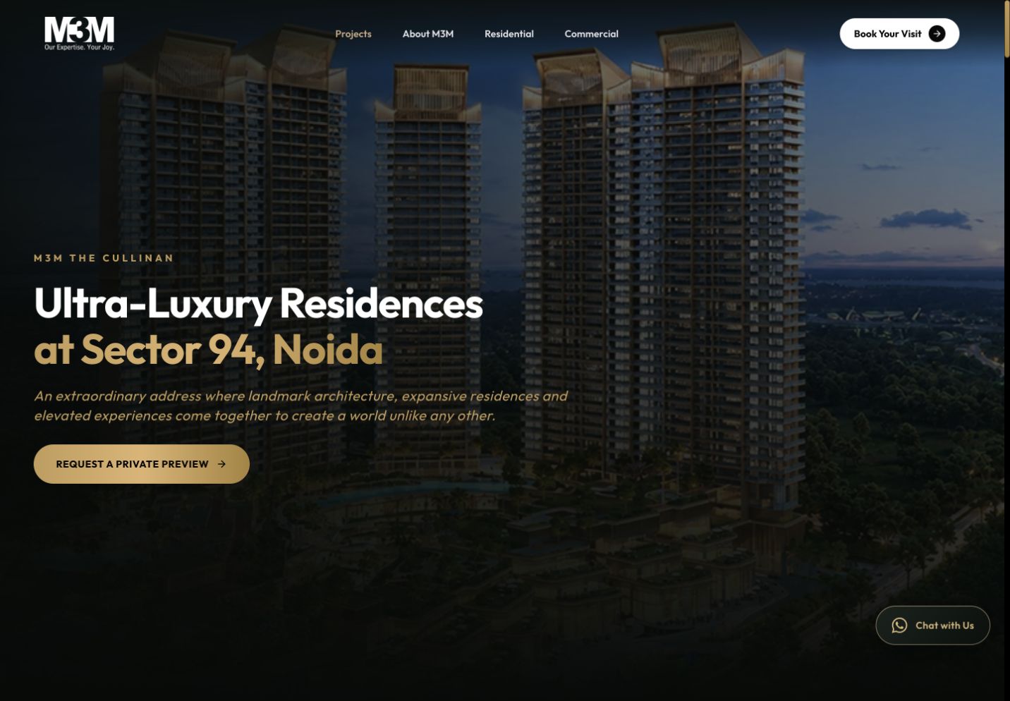
Design rationale
A focused introduction answers what the property is and where it is located. Supporting document access still matters for visitors who are comparing options.
Amenities: from floor-based tabs to lifestyle groups
Before · WordPress
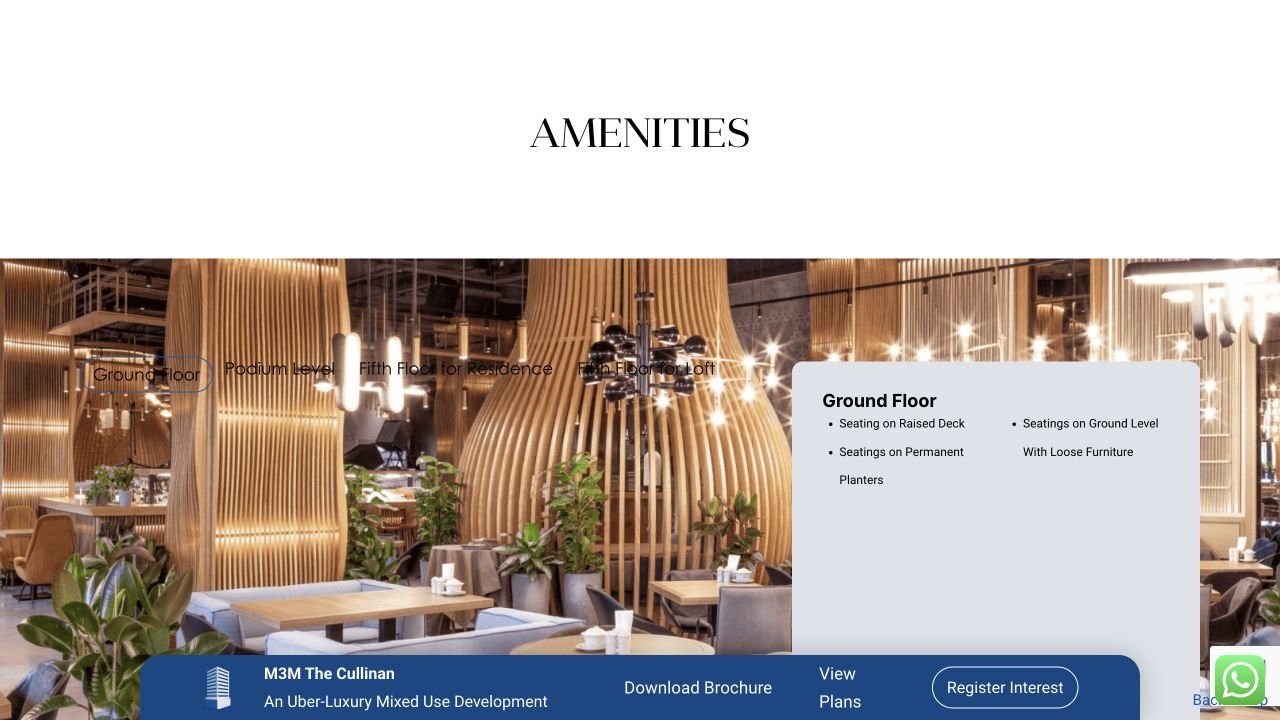
After · New website
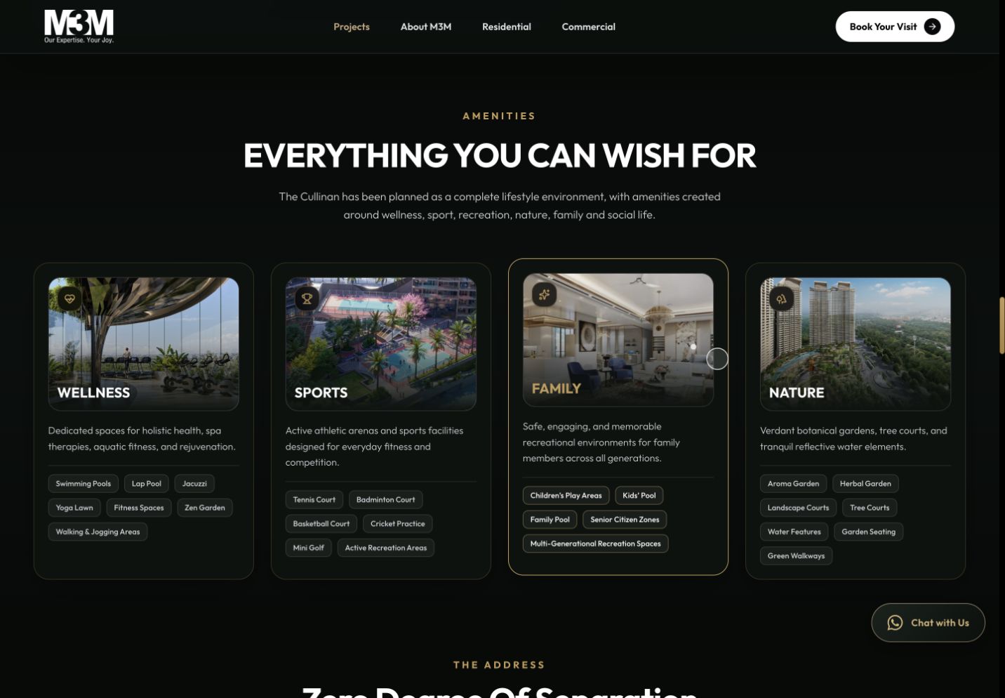
Design rationale
The new grouping supports browsing by interest and exposes several categories together. The old layout instead organises the information around building levels.
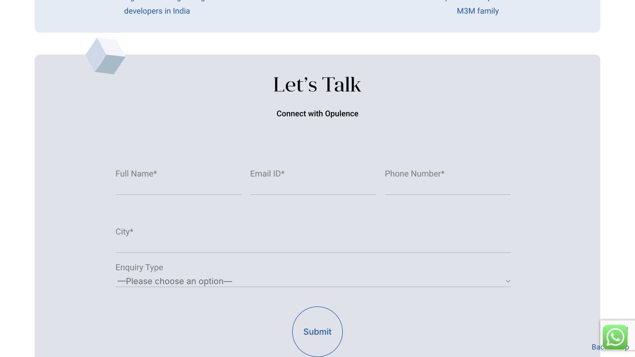
Enquiry: form, context and direct contact together
Before · WordPress
After · New website
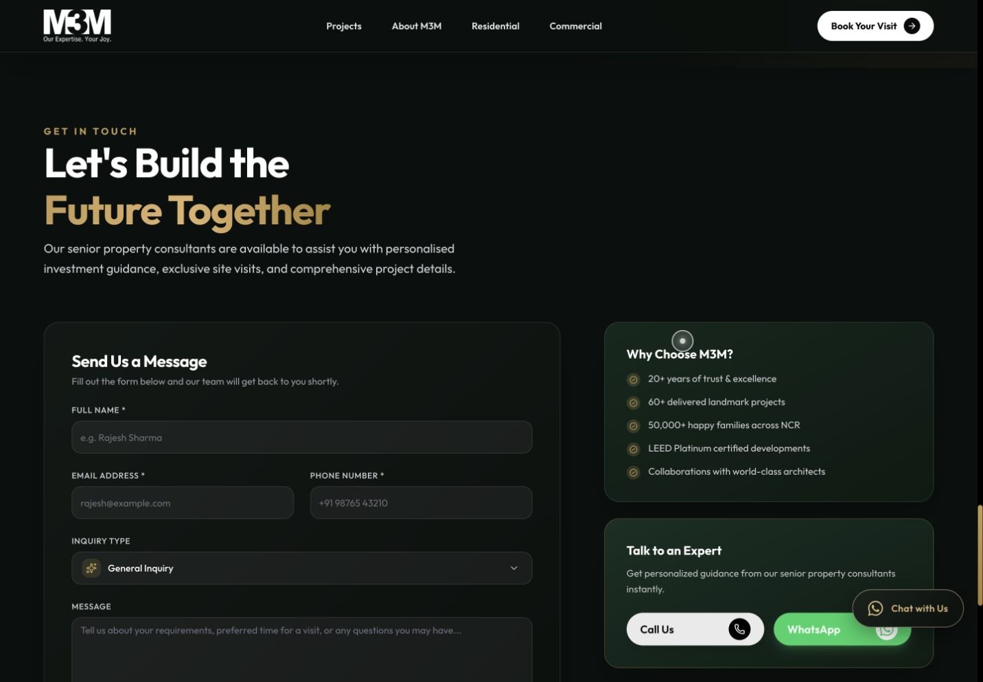
Design rationale
The redesigned layout gives visitors both a written enquiry route and direct-contact choices. Screenshot review does not establish successful message delivery.
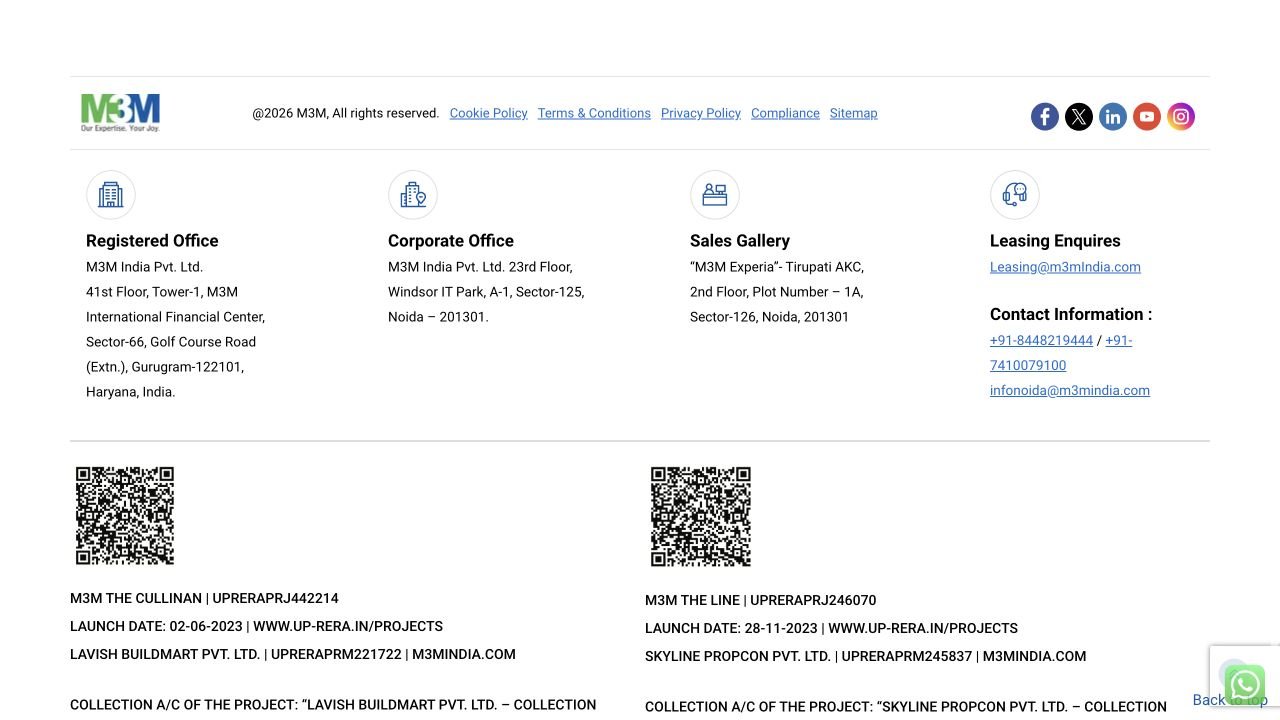
Footer: a structured second route through the website
Before · WordPress
After · New website
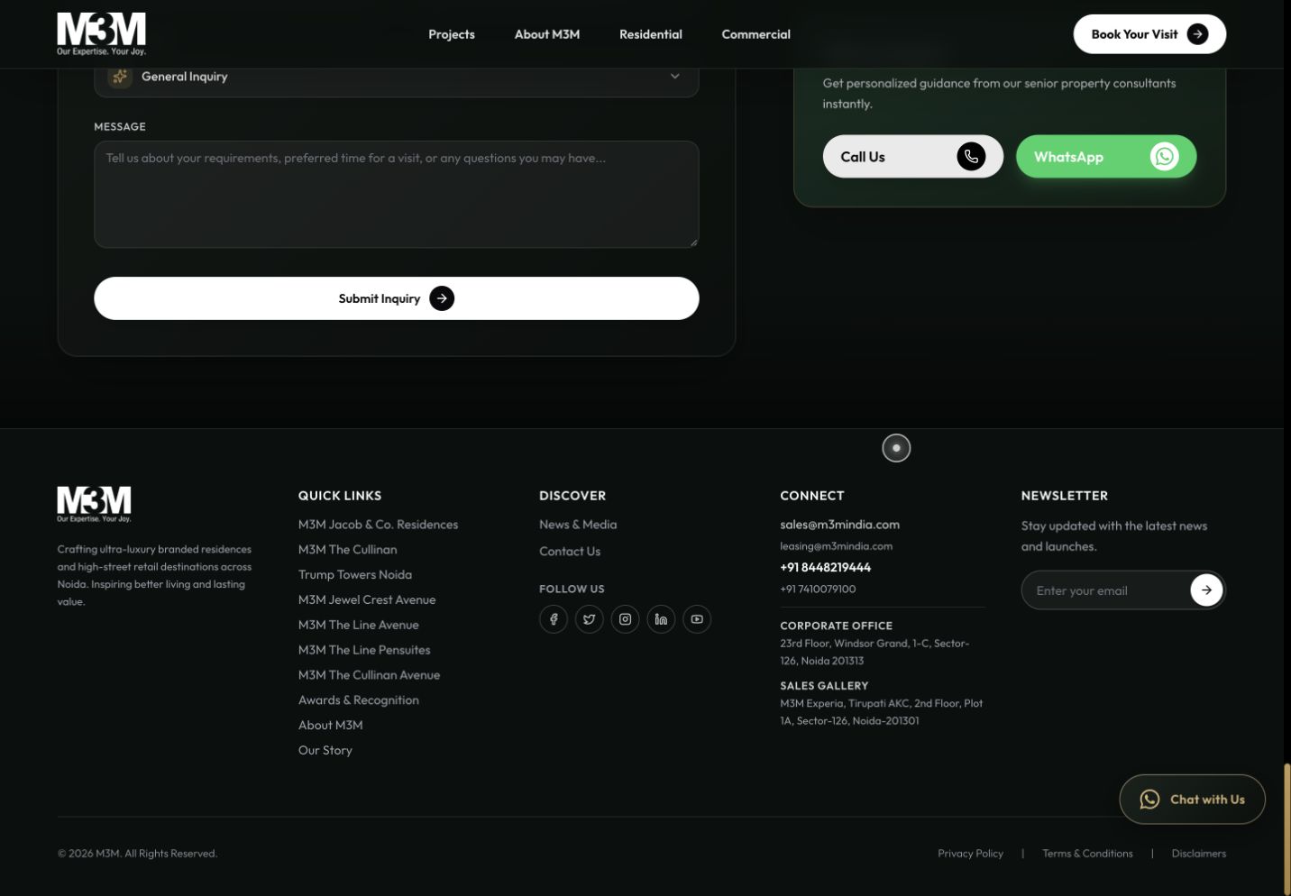
Design rationale
A visitor reaching the end gains another route into project and brand information. Visual simplification does not replace the need to retain required property disclosures.
Making the property collection scannable
All Projects, Residential and Commercial controls organise the collection around visitor intent. Cards combine a recognisable name, category, location and short description with a route to the relevant detail page. Repeated placement helps visitors compare the same information across properties.
Selecting the residential category updates the URL with type=residential and the projects-grid anchor. This supports direct category entry from navigation and the homepage. If the collection grows, research could justify location or configuration filters; category filtering alone does not replace richer property comparison.
04 / VISUAL LANGUAGE & MOBILE
Preserve the choices, adapt the composition
Near-black and deep green surfaces frame the architecture. White text and warm gold accents establish hierarchy, with prominent headings, supporting copy and uppercase section labels. The source includes Outfit, with serif styling in selected project sections.
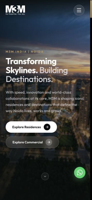
On mobile, a compact logo and menu trigger replace the expanded desktop navigation. The headline reflows and the residential and commercial CTAs stack vertically. A WhatsApp shortcut remains near the lower edge. Both category entry points survive the change in screen size.
The mobile capture demonstrates this homepage composition; it does not establish complete device compatibility or accessibility conformance. Large visuals also require efficient delivery and readable overlays across changing frames.
05 / IMPLEMENTATION
A shared system for brand and property pages
The reviewed local implementation uses React, Vite and React Router, with 17 application routes including seven property detail pages. Shared components cover navigation, footer, project cards, galleries, floor plans, location and contact sections. Repeated patterns can be maintained centrally while each property retains its own content.
- Lazy-loaded page modules and locally hosted images, fonts and hero media.
- Responsive image handling with generated media variants.
- Route-specific metadata and a build step for route HTML metadata.
- Shared project enquiry handling with server-owned project identifiers.
The enquiry interface supports different levels of readiness through visit requests, sales questions and direct contact. Project enquiry handling includes failure and uncertain-outcome states, but real delivery depends on server configuration and service availability. Homepage and Contact integrations were documented as pending in the reviewed project.
Implementation details describe the source reviewed for this study. They are not a loading-time benchmark, search-ranking result or end-to-end delivery certification. This study does not assert a direct M3M commission or sole authorship of retained work.
06 / OUTCOME & LEARNINGS
A clearer progression from aspiration to understanding
The reviewed redesign establishes explicit category choices, visible desktop navigation, consistent project cards and a focused property introduction. A live multi-page website and actual desktop/mobile captures document those changes. These are observable deliverables, rather than evidence of increased sales.
What was reviewed
- Eight live before/after section pairs across the homepage and Cullinan page.
- Residential category selection and its URL state.
- Mobile homepage composition.
- Route structure, shared components and enquiry documentation.
What to measure next
- Success finding a property, brochure or floor plan.
- Category-to-detail journeys and abandonment points.
- Valid submissions, confirmed delivery and qualified leads.
- Keyboard access, contrast, mobile usability and field performance.
The main lesson is that premium imagery and clear decisions need to work together. A high-intent preview CTA serves one audience, while comparison-stage visitors need easy access to supporting information. Consistent patterns help both groups, but reliable contact delivery and accurate property content remain essential to trust.
The eight desktop comparisons were captured from the old and new live websites on 3 November 2026. The mobile capture and source-code review were prepared on 31 October 2026. No analytics baseline, user interviews, conversion lift or full production QA sign-off was supplied. Audience models and expected benefits remain hypotheses.
Previous WordPress website · New live website. Desktop comparisons show the live versions; the earlier mobile capture shows the local implementation.